
Button block
A Button block is a call to action: a labelled link that stands out from the surrounding copy. Recipients tap it to open the URL you set.
What is a Button block?
A Button block is a call to action: a labelled link that stands out from the surrounding copy. Recipients tap it to open the URL you set.
Use Button for the main action (shop, register, read more). Use a Menu block for a row of text links, and an Image or Video link when the tap target should be a picture.
How to add
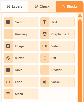
- Open the Blocks tab in the left sidebar.
- Drag Button into a column on the canvas.
- Click the block to edit its content and properties.
Properties
Select the Button block, then open the Properties tab on the right. These controls change how this block looks and behaves.
| Property | Options | Used for |
|---|---|---|
| Label | Button text | What recipients read on the button |
| Link | href and link title | Where the button opens |
| Colours | Fill, label, and container background | How the button stands out |
| Width | Auto, fixed, or full | How wide the button is in the column |
| Typography | Font, size, weight, and text transform | How the label looks |
| Inner padding | px around the label | How tall and roomy the button feels |
| Content padding | px around the button in the column | Space between the button and neighbours |
| Border and radius | Width, colour, style, and a single corner radius | Outline and rounded corners |
| Hide | Off, mobile, or desktop | Keep the button off one breakpoint |
Related
Blocks paletteThe Blocks palette is the list of things you can drag onto the canvas: Section plus every content block.All propertiesThis index lists shared property groups and the articles that document each block’s own fields.Sections and columnsA section is a horizontal row. Columns sit inside that row and hold the blocks recipients see.
Still need help?
Contact Support and we will get back to you.
Email support@openly.email
Feedback or suggestions?
Report a bug or share an idea.